LookerStudio - Report
To save time, duplicate one of the reports provided by Cadulis: you can then modify it as needed.
Alternatively, you can create a blank report and add your own visualizations.
Activities Demo
Below is a sample dashboard to visualize your activities data (interventions, calls).
Go to the following link and duplicate the dashboard to integrate your own data! (you must have created your data source beforehand)
Licenses (Credits) Demo
Below is a sample dashboard to visualize your license consumption.
Go to the following link and duplicate the dashboard to integrate your own data! (you must have created your data source beforehand)
Creating the Report
LookerStudio opens a new report, based on the data source we just configured.
You should see an initial visualization.
At the top of the page, change the report title: this will help you find it more easily!
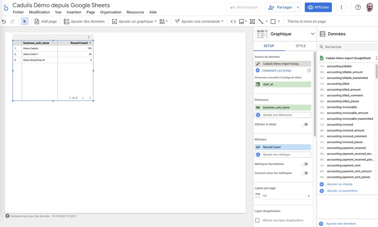
Add a Visualization
On the report, you can add a chart by clicking the corresponding button in the menu.

Choose the type of visualization you want and place it on the page.
Configure the Visualization
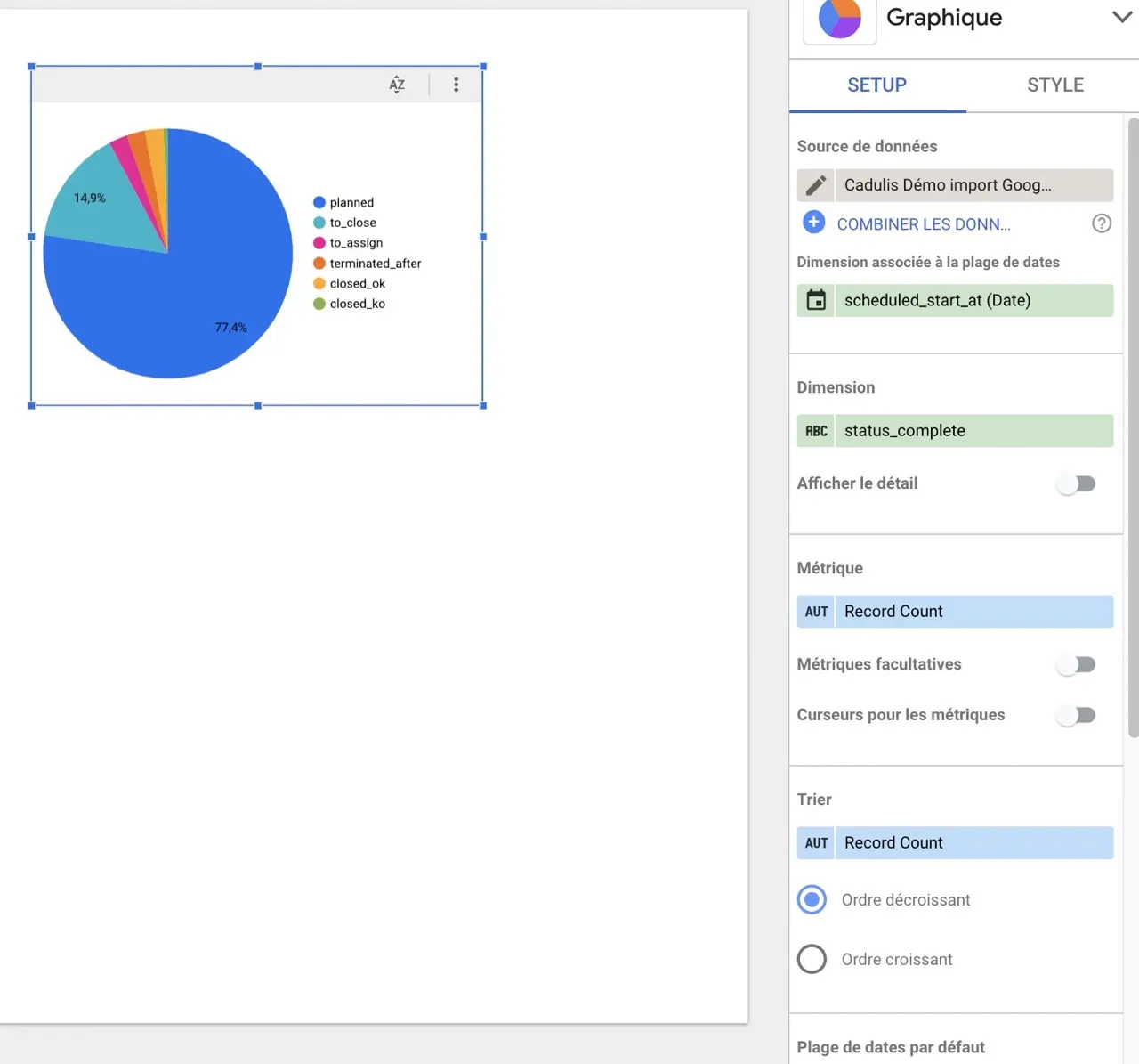
For example, let’s add a pie chart.
In the chart configuration (simply click on the chart you want to configure), replace the Dimension field to select status_complete.
You can also change the Date range dimension field to select scheduled_start_at (scheduled start date).
Add an Activities Table
By adding a Pivot table chart, you can list the filtered rows based on other charts:
Click Add a chart then select Pivot table.
In the chart configuration, remove the metrics and add all the columns you want to display under Dimension.
The list of activities you are interested in is displayed in the table.
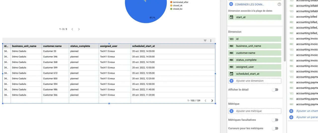
In the table configuration, you can set the maximum number of rows to display per page.
Add a Map
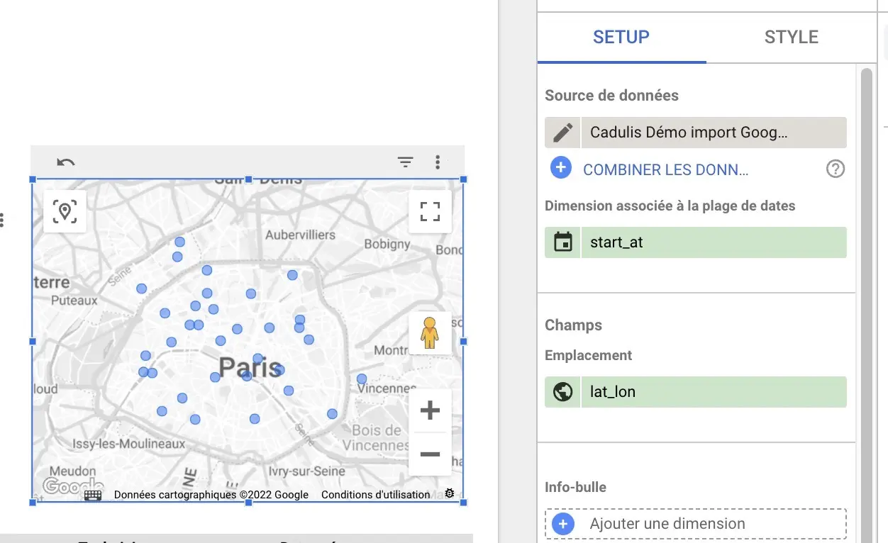
If you have added the lat_lon field as explained in the data source configuration, simply add a “Map” chart.
DataStudio will automatically use the correct “Latitude, Longitude” field.
The list of activities you are interested in is displayed in the table.

In the table configuration, you can set the maximum number of rows to display per page.
Filter the Page
Add Filters
For example, you can add a date filter:
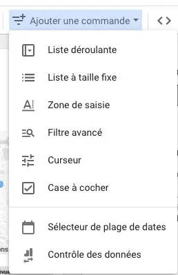
Select date range.
Cross Filters
By clicking on elements in the charts, all other charts are automatically filtered!
At the bottom of each chart’s configuration, you will find a Cross-filtering option (under “Chart interactions”).
If you leave this option checked, the chart will be filtered when you select a value in another chart.
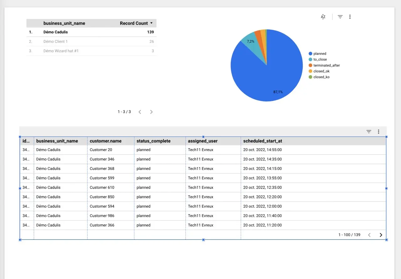
For example, here I clicked on “Démo Cadulis” in the top table, which gives me the number of records per business unit.
My table is then filtered according to my different selections.
View
By clicking on View, you exit edit mode.
You can then interact with your previously configured charts and data.
Share
There are many sharing options that allow you to make the report available to your colleagues, clients, etc.
- You can share the report link: the person will then have access to filters, etc.
- You can generate a PDF that is automatically sent to an email address: perfect for a client!


