PowerBI report
On your dashboard blank sheet, you will see 3 buttons on the left:
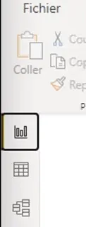
- The first one lets you edit your
report(visuals: graphs, texts, etc.) - The second one lets you edit your data and create calculated fields (for example, a new column)
Pie Charts
Let’s add a chart:
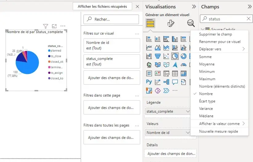
In the right sidebar Visualizations, click on Pie Chart
When you click on a chart present in your report, you access its configuration:
fields used, calculation mode (count, sum, etc.), and display (title, labels, colors)
- In the right section
Fields, search forstatus_complete: click and drag this field to theLegendarea of your chart configuration. - Still on the right, search for
idand drag the field to theValuesarea of the configuration. - To the right of the
idfield you just added, expand the options with the arrow and chooseCount: here we want to count the rows, not sum them.
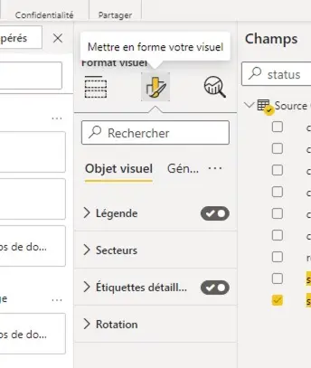
The Format section of the Visualizations tab in the chart configuration lets you edit the title, colors, labels, etc.
Table
Now we want to display the list of activities that correspond to the different sectors of our chart.
In Visualizations, choose Table
Add fields to the columns, as before.
Some fields will be grouped by default by PowerBI. If you want to display all rows of your data, make sure to expand the field options and select “Do not summarize”
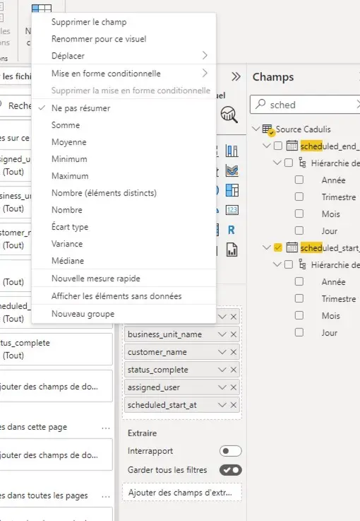
By default, for a date-type field, PowerBI expands the “date hierarchy”; you can disable this option on the field
You can rename columns in the options for each field
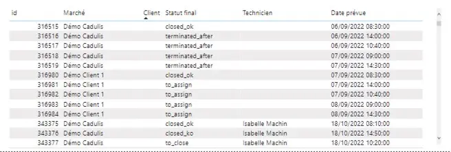
When you click on a sector of your pie chart, the table is automatically updated!
Date Filter
In PowerBI, filters are created using the SLICER visual
Add a Slicer visual and add the scheduled_start_at field
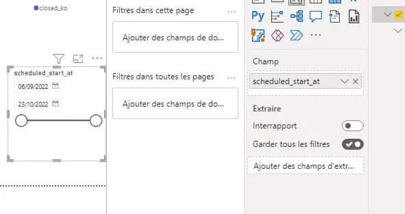
Feel free to customize the display. Changing the dates in this slicer allows you to filter the entire report.
Report Filters
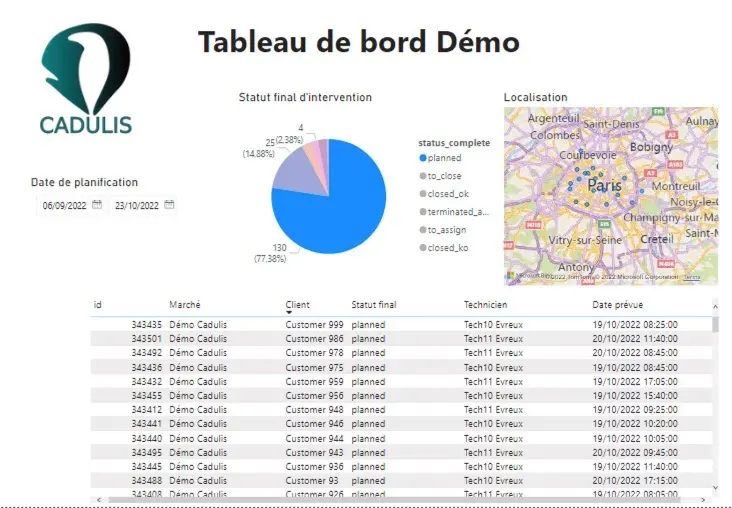
Now it’s your turn!


